Gahkuen Link
CLIENT
Grad Project
ROLE
UI/UX Designer
PRODUCT
JRPG Game
Time
5 Months
Overview
Gahkuen Link is a sci-fi JRPG where I redesigned the UI to enhance its futuristic and dynamic style. Over five months, I worked as a UI/UX designer, handling wireframes, usability testing, style guides, and animations. The goal was to create a consistent, impactful interface aligned with the game’s action-heavy combat and futuristic aesthetic.
My Role
As a UI/UX Designer, I developed the platform’s structure, designed interactive dashboards, and created animations to enhance usability with Adobe After Effects. I collaborated closely with the development team to ensure responsive designs and worked on refining prototypes based on user feedback.
Goals
The goal was to create a consistent, impactful interface aligned with the game’s action-heavy combat, player movements and futuristic aesthetic.
Challenges
Another issue was creating animations and rankings that felt rewarding without overwhelming players during intense gameplay. Collaborative feedback from the game team helped refine these aspects.
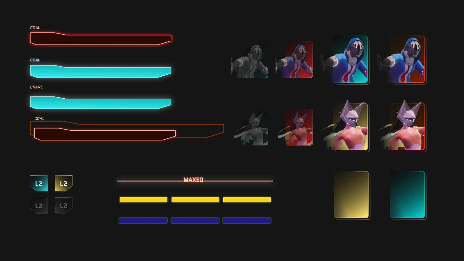
The biggest challenge was balancing a minimal design with information-heavy elements, like the skill list with multiple layers of data. Ensuring UI consistency across dynamic HUD elements and skill menus was complex. Color palette selection also required iteration to avoid unintended tones, like overly "evil" or "clinical" vibes.
Testing: UI & Animations
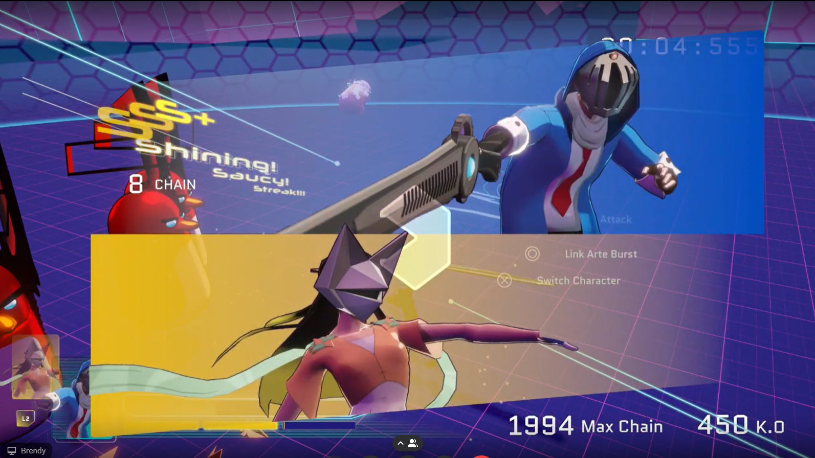
Animations inspired by games like Devil May Cry engaged players, with rankings like "Shining Saucy Streak" motivating them to achieve higher combos and KO’S.
Surveys confirmed that 7/10 testers found the UI intuitive, and animations synchronized well with gameplay dynamics.
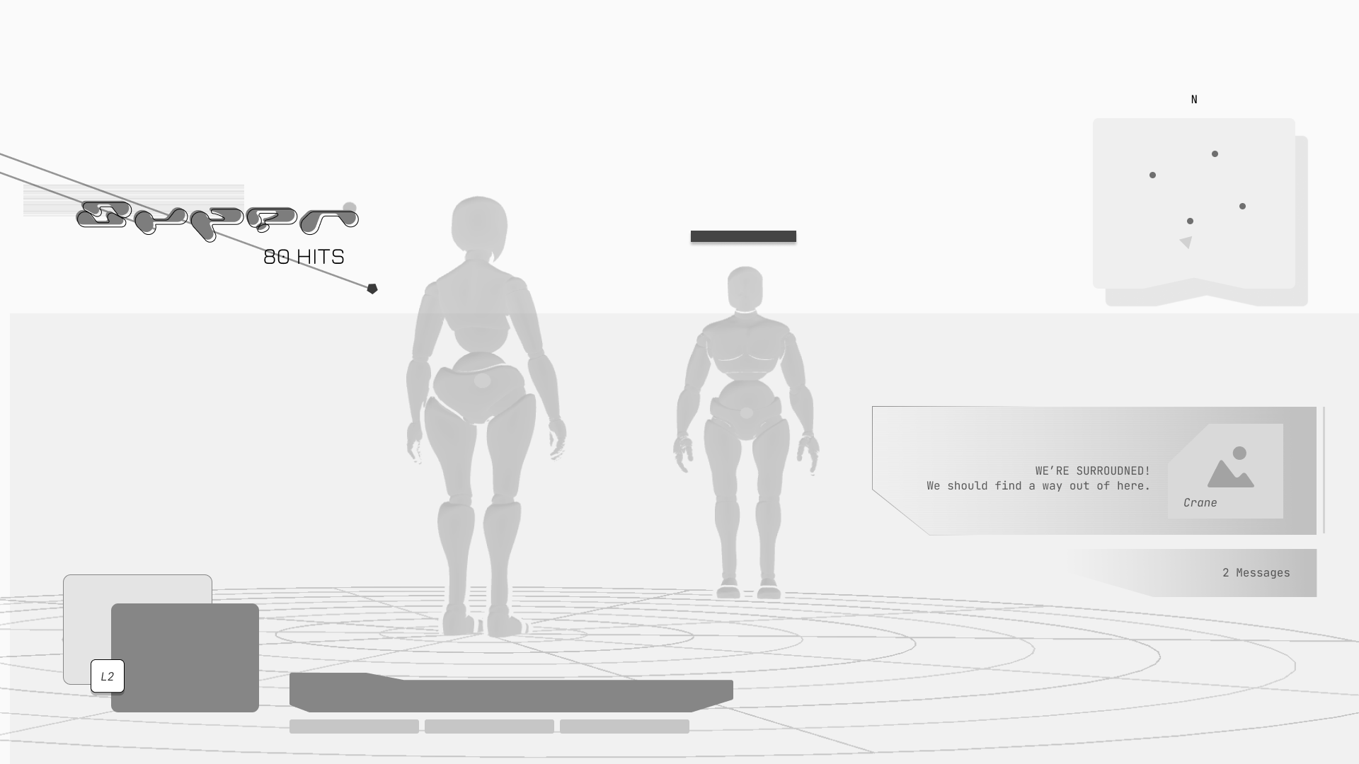
Testing focused on wireframes, usability, and the effectiveness of animations. Testers rated Composition 2 the most readable, while Composition 3 stood out for its futuristic style.
Old & New UI
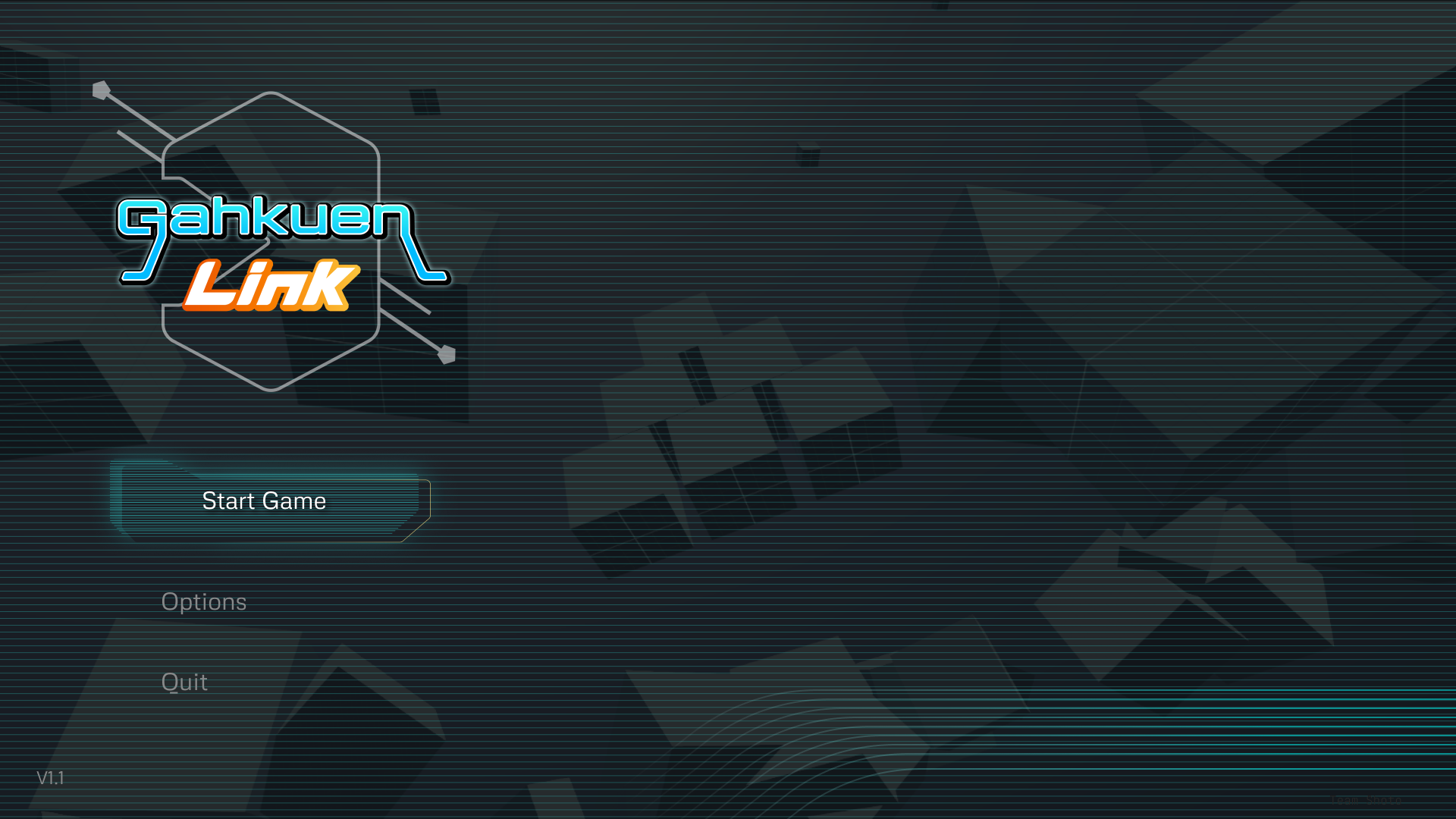
The old UI of Gakuen Link felt bulky, clunky, and disconnected from the game’s futuristic, urban theme. While it had cyber-inspired typography, it lacked dynamic compositions, cohesive design, and clear visual hierarchy. Key issues included cluttered menus, a lack of impactful animations, and an over-reliance on generic JRPG elements.
The new UI introduced dynamic, angled compositions inspired by futuristic games like Mirror’s Edge and urban titles like Persona 5. Diagonal framing, thin lines, glow effects, and bold typography created a high-energy, tech feel. Animations tied to gameplay actions, such as hit combos and skill activations, added motion and intensity. The color palette shifted to a balanced 60-30-10 ratio of blue, yellow, and orange, ensuring vibrancy while avoiding clutter. These updates made the UI feel more dynamic, immersive, and visually consistent with the game’s sci-fi setting.
Results…
The redesigned UI increased player clarity and engagement, with 80% identifying the style as futuristic and dynamic. Animations and visual cues motivated players, and stakeholders praised the consistent visual language. Feedback confirmed the UI successfully balanced clarity with an energetic, immersive style.
and Reflections!
This project made the value of iterative testing and collaboration clear. I learned to balance complex information with cohesive design and align visuals with gameplay.
However for a future project I would spend more time testing different animations and see if animating directly in Unity is less performance heavy.
Want to see more?Here are my works.


